


Have you been flocking to dashboards to get updates on the state of Coronavirus cases around the world and in your community? You’ve likely seen many flavors of slicing and dicing the same data at a global and local level. In the flurry of recent news and activity, a consistent and trusted source of data is very comforting. Aside from the current global crisis, many of our clients routinely use dashboards to depict information across their organization. Dashboards can be used to view if a system is operating as expected (e.g. your engine temperature on your car dash), to track real time progress against a goal (e.g. a fundraising thermometer), or to measure the impact of a response (e.g. determining if social distancing is indeed "flattening the curve" of new COVID-19 cases).
Maybe you have data at your fingertips and conducted some analysis, but might not know how to communicate that broadly with your organization. What makes that a good visualization versus a bad one? How do you convey a compelling story without misleading or blowing things out of proportion? How do you ensure everyone can ingest the information equally, including people different from ourselves? Considering these things and more through a thoughtful, design-centric approach will ensure success.
# 1. What is your goal and who is the audience?
When starting this journey, keep the end goal in mind. Understand your audience and the decisions they will make based on the information provided. The context and device your audience will be using to view this dashboard will directly impact the information and how it will be displayed. Different business-based activities will determine what information your audience will want. Analytical dashboards will contain large amounts of comprehensive data that will allow analysts to drill down and extract insights from visualizations. Strategic dashboards are created with more critical, trend-based information to monitor long-term company strategies.
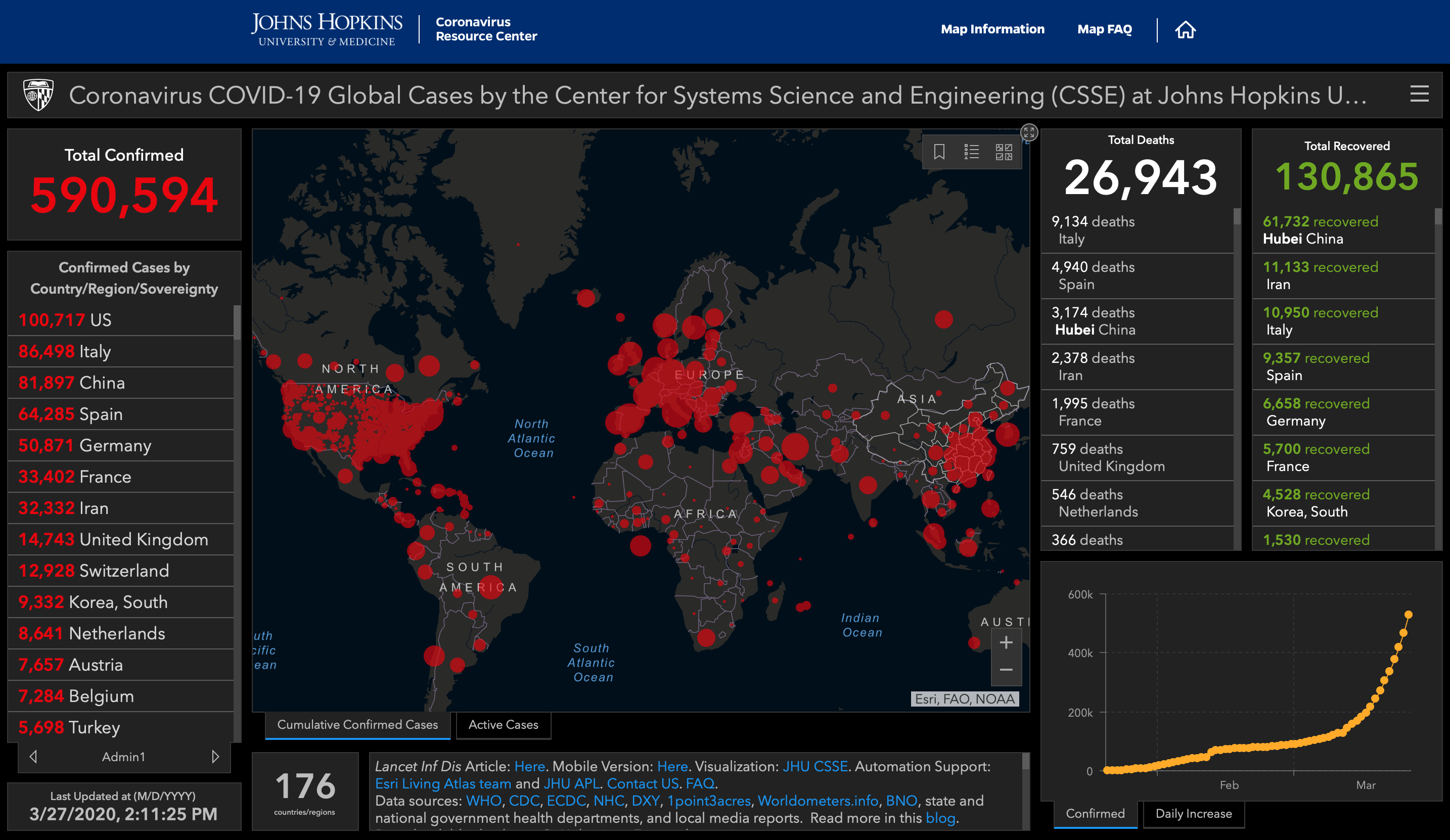
The Johns Hopkins coronavirus dashboard can be understood without any background in statistics and even without knowledge of the English language. It shows a snapshot of current state and is interactive for use by people around the world.
# 2. What types of visualizations will meet the goal?
Dashboard-centric charts and visualizations fall into four primary categories: comparison, composition, distribution, and relationship.
Comparison charts are one of the easiest to comprehend. They are used to evaluate values between two or more data points.
Composition charts are used to show the individual parts that make up a whole.
Distribution charts use the functionality of both comparison and composition to help analyze what is related or unrelated.
Relationship charts are used to show whether something does or does not affect another variable. You can use these relationships to understand correlation, trends, clusters, and outliers.
# 3. How are you telling the story?
Effective dashboards use Color Theory to tell a story with the data. Color can draw your eye to an image, evoke emotion, and even communicate something with no words at all. Here are a few tricks to ensure the information on your dashboard isn’t being overshadowed by poor design:
Leverage colors to invoke tone: Using particular colors can dictate tone. Notice the use of red in the virus dashboard, connotating a negative emotion. Recoveries are green. Be cognizant when choosing colors that can evoke a certain tone.
Be inclusive for everyone: Green and red are often used as they are complementary colors. However, they’re impossible to distinguish for those who are colorblind. Use patterns or textures instead. Bring people into your design process who represent the actual audience to ensure you’re not excluding people unintentionally.
Use the color wheel to ensure readability: You have a few options when it comes to deciding what colors to use. An easy option is following your company’s brand colors. If that isn’t an option, you can default to color template tools to ensure your design is pleasing to the eye. This will ensure readability of the data.
The assembly of visualizations also helps to tell your story: Using the Johns Hopkins COVID-19 dashboard as an example, the most important chart is the largest visual and central focal point. Your eyes also focus in on the larger font for the totals confirmed, deaths, and recoveries. They made use of color theory focusing the positive information in green and the rest in red or a neutral color. Particular charts that represent the different categories, e.g. the distribution of confirmed cases not only in the map but also per day in the bottom right and basic statistics are used on either side of the map to represent comparisons of each country.
Following these best practices isn’t a one-and-done activity. Notice how some Cornonavirus dashboards have been changing slightly over time as their audiences and feedback mechanisms grow? Teams can take an iterative design approach until they can deliver the quality needed to make impactful decisions based off the data.
# 4. Behind the scenes – the importance of data quality & readiness
In addition to iterating on the design of the visual, companies also often iterate as they improve data readiness and data quality that feed dashboard visualizations. Source data trust, integrity, and quality, are essential precursors for a valuable visualization. Prior to embarking on any visualization project, be sure to ask these questions:
1. Do the essential data elements required for the dashboard already exist at the granularity required for the visualization (example: daily data at the customer level)?
2. Is the organization aligned on the ownership, definition, and single source of key metrics?
3. Is the data source "clean", or are there gaps and inaccuracies that could cause misinterpretation for users reading the dashboard?
4. Does the security model of the data allow for visibility to users, while obfuscating data that may not be shared?
5. Does your organization’s culture promote democratization of data?
Sometimes getting a "yes" to these questions can spark entire programs or initiatives of their own. If your answers are “no", you’ll need to focus on these foundational pieces, or take an iterative approach before creating reliable and meaningful dashboards.
Understanding these concepts will empower you whether you’re consuming information in your daily news, or creating dashboards for your organization.
Be sure to check out the Data & Analytics page for more insights into how we position our client’s teams for success as they evaluate data, build models, and identify trends to drive better predictions.
Special thanks to Bethany Atkins for contributing to this article.

Alexis Pugh is the consummate connections curator and challenge seeker. Alexis’s experience includes technical roles at FedEx Services and Chico’s FAS Inc., where she defined and executed global cloud and data analytics strategies. She holds a bachelor’s degree in business analytics and marketing from the University of Tennessee at Knoxville.

Molly Lebowitz’s secret to business success is a unique blend of empathy, listening to understand, and strategy with action. Her experience includes roles at Intel, Play-Well TEKnologies, and Arcadis, where she designed and executed global initiatives that fueled innovation and organizational efficiencies. Passionate about STEM education, Molly is also an active volunteer for PDX Women in Tech and serves on the board of STEM Like a Girl. She holds a bachelor's degree in biological and environmental engineering from Cornell University.